

Māori and Housing in Tāmaki Makaurau and Beyond - 1986 to 2013.
An interactive data presentation
In this interactive presentation, we show changes in Māori home tenure over the past few decades. The data for this work was sourced from Statistics New Zealand and compiled in a way that makes it highly accessible. While we present some analysis of the data, the interactive visualisations allow anybody to explore the data to investigate their interests.
The data gathered by Statistics New Zealand have changed significantly over time. We have grouped the many different ways that tenure has been measured over time into a few key measures, focusing on ownership, rentals, and state housing. Rather than looking at total numbers, this presentation is directed towards highlighting changing patterns in tenure over time, for different ethnic groups, and in different locations.
The visualisations produced by this work show the proportion of home tenure, for a single ethnic group, in a single area, at a single point in time. For example, in a chart shows 50% ownership, that means that the remaining 50% is made up of the other tenure types (renting, Housing New Zealand, etc.)
Tāmaki Makaurau
The first chart shows housing tenure in Tāmaki Makaurau. We show three ‘Zones’ as well as data for the entire region. Any of the filters on the right side of the visualisation can be changed to investigate the data. Hovering over the chart will display key information. The current settings display changes in the proportion of Māori households renting in Tāmaki Makaurau over the past few decades.

Analysis
There is a large jump in proportion between 1996 and 2001. This is partially due to a change in the way Stats NZ classified data, however, it also illustrates the magnitude of the increase in rentals for of Māori. By 2013, at an Auckland regional scale, 58% of Māori were renting up from only 18% in 1986 . Switching to ownership, the chart shows that during the same period, ownership decreased from 52% in 1986 to 32% by 2013.
The largest decrease in ownership was seen in the Western Zone, where ownership for Māori fell from 69% to 37% from 1986 to 2013. In contrast, rentals increased dramatically during this time. For example, in Western Auckland, rental increased from 14% in 1986 to 54% in 2013. Southern Auckland experienced a 53% increase in rentals during this same time.
The European ethnicity group experienced a similar pattern of tenure changes, however, which several significant differences. The chart shows that renting increased across all zones. However, the increases begin from a much lower starting point than Māori and increase less dramatically. For example, in Southern Auckland, European renting starts at 9% in 1986, rising 20% to 29% by 2013. At the same time, Māori renting starts at 10% in 1986, rising 53% to 63% by 2013.
Similarly, in the ownership data, European ownership proportions drop from 85% in Southern Auckland in 1986 to 53% in 2013, a decrease of 32% while Māori ownership dropped by 27% from 57% to 30%. On average, Māori rentals as a proportion of tenure increase by 37% from 1986 to 2013 in across all Auckland zones while European rentals increased by 17%. At the same tome Māori home ownership as a proportion of tenure dropped by -22% while European ownership dropped by -31%.
While the decrease is ownership is similar for both the European and Māori groups, Māori began from a significantly lower starting position, meaning the magnitude of the impact is more severe. Additionally, European rentals have not increased at the rate of Māori. Possible explanations for this could be the European group has divested investment properties which have been brought by other groups, or that children are staying at home longer in the European group and not renting houses. Additionally, there has been a larger increase in the European group placing homes in family trusts, which are categorised separately by Statistics New Zealand.
Regional Trends
In the next visualisation, we compare tenure across multiple regions in New Zealand. The map highlights changing patterns of ownership throughout New Zealand, showing that Auckland is not always representative of Māori home tenure.
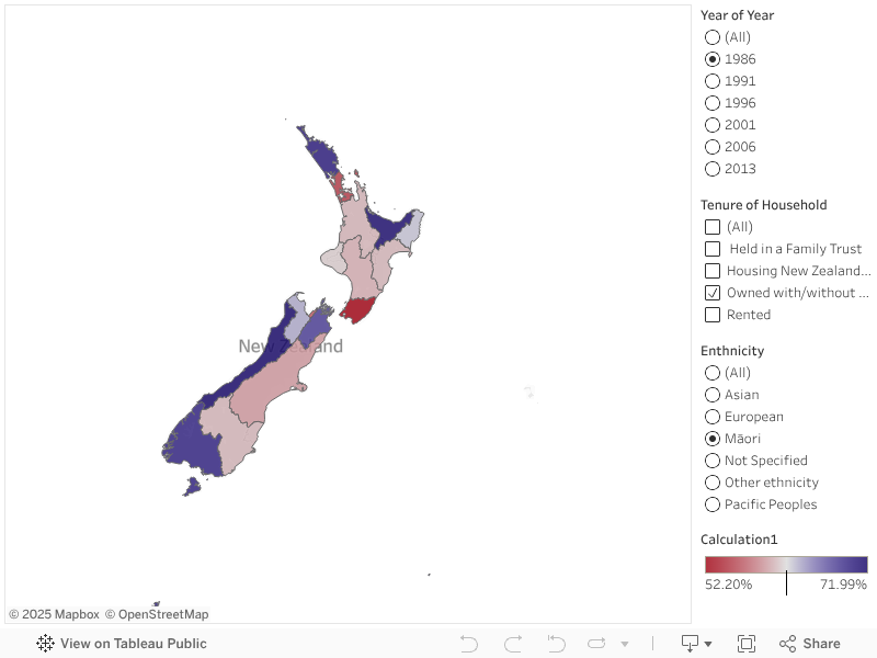
Analysis
There are differences in ownership patterns for Māori home tenure from region to region; however, all regions have seen a decline. For example, ownership drops by 18% in Canterbury while falling by 33% in the Bay of Plenty. On average, ownership declined by 23% throughout New Zealand. Over the same time, the European Group’s ownership proportion drops by an average of 27% with Auckland showing the largest decrease.
Māori rentals increase nationwide with Gisborne at the high end rising by 39% and Tasman at the low end rising 19%. On average, rentals as a proportion of tenure rise by 33% for Māori from 1986 to 2013. Over the same time, the European group has a much lower rise of 14% on average, from 9% in Tasman to 17% in Gisborne. The only region of New Zealand where ownership makes up over 50% of home tenure for Māori is the West Coast. Meanwhile, the European shows over 50% home tenure in all 16 regions.
In addition to low proportions of home ownership and rapidly increasing rentals, Māori face other serious housing challenges. Crowding statistics go beyond tenure alone to show how homes are being used by Māori and how this compares with other groups.
Crowding
The data on crowding are sparse, and the only reliable statistics we were able to obtain to show how crowding differs between Māori and others come from 1951, 1961, and 1971. In the visualisation below, the vertical axis shows how many rooms are in the house, while the horizontal axis shows how many people live in the house. A low number of rooms with a high number of people indicates crowding. The bars in the visualisation show how many households have that particular combination of rooms and people.
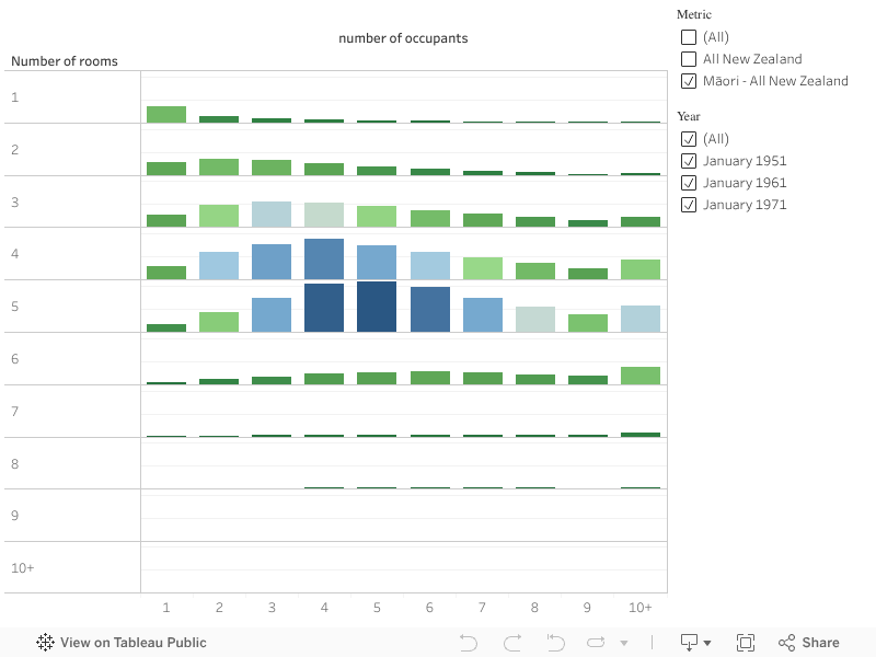
Analysis
There is a clear visual difference between the Māori specific crowding data and the data for all of New Zealand. The Māori data has a stronger bias towards the right side of the chart, indicating a higher proportion of households with a higher nuber of occupants.
As an example of this, in 1971 there were 1549 counts of a 5 bedroom household with 10+ occupants across the whole of New Zealand, 858 of which were Māori households, meaning Māori made up 55% of these households in New Zealand. Over time, the number of low bedroom high occupancy households has decreased for Māori, however the mid range of rooms and high number of occupants has remained relatively stable. A next stage of this work will be to see if we can trace these patterns through to the present and look at interactions with renting and ownership trends.